This is a personal/organizational site meant to carry Muraly's mission and work to a global audience. With editorial-style content, the biggest challenge wasn't visuals — it was making sure the writing itself reads clearly from start to finish.


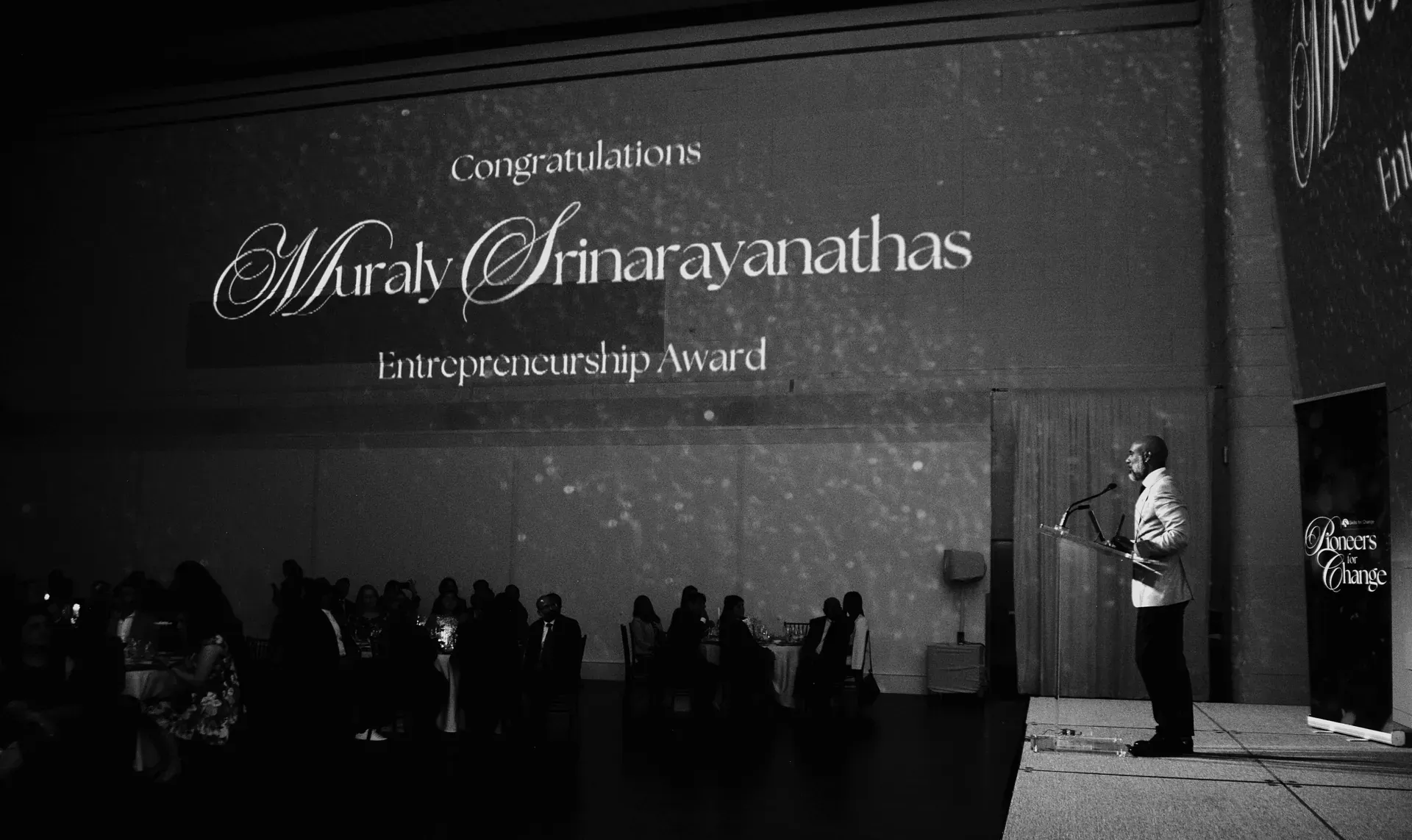
This is a personal/organizational site meant to carry Muraly's mission and work to a global audience. With editorial-style content, the biggest challenge wasn't visuals — it was making sure the writing itself reads clearly from start to finish.
Readability came first: typography with strong contrast, line lengths short enough to avoid eye strain, and content broken into a natural reading rhythm instead of dense blocks. Visual hierarchy was designed so readers always know where they are in the story, even when skimming.
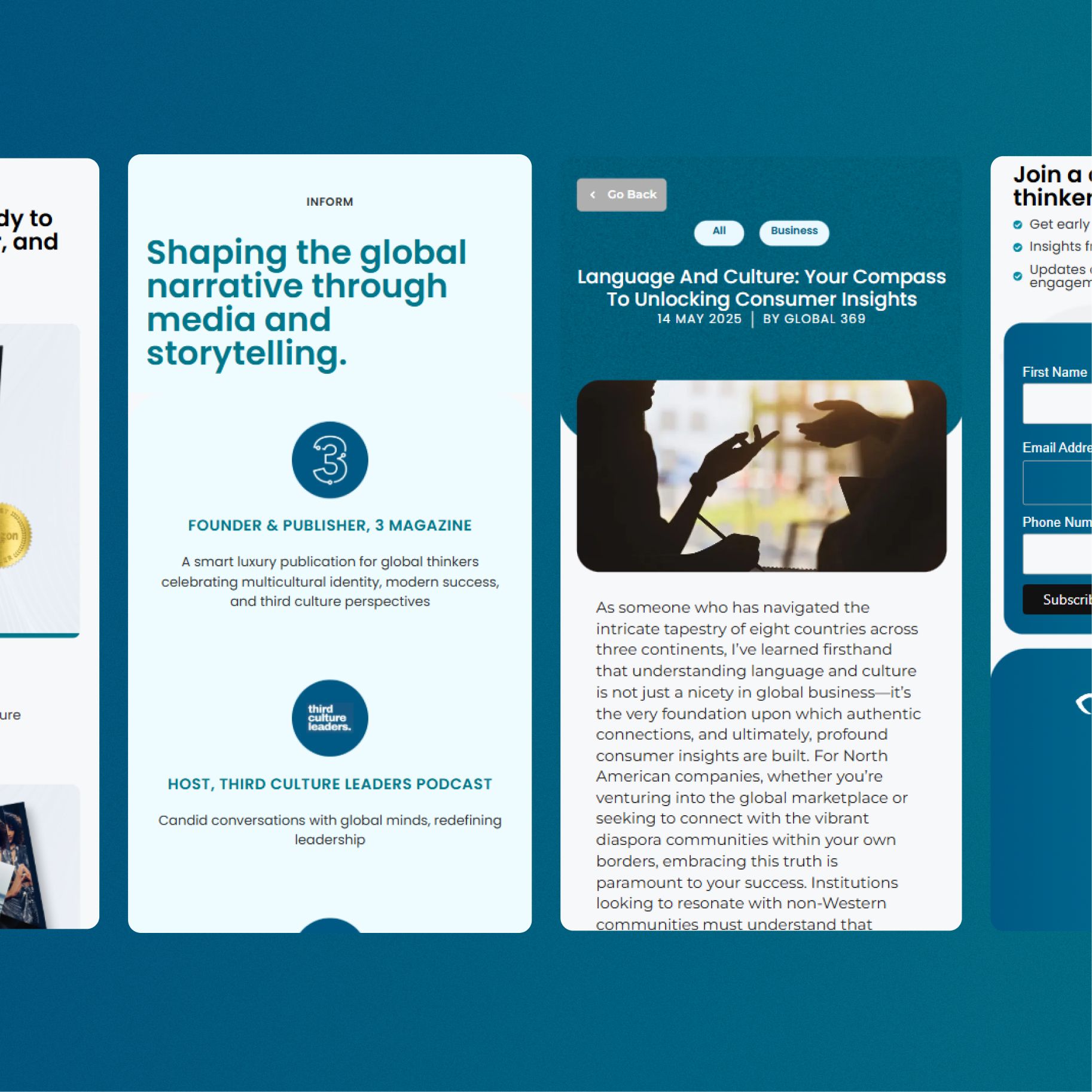
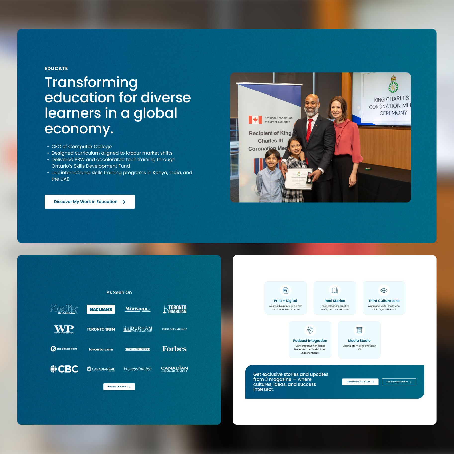
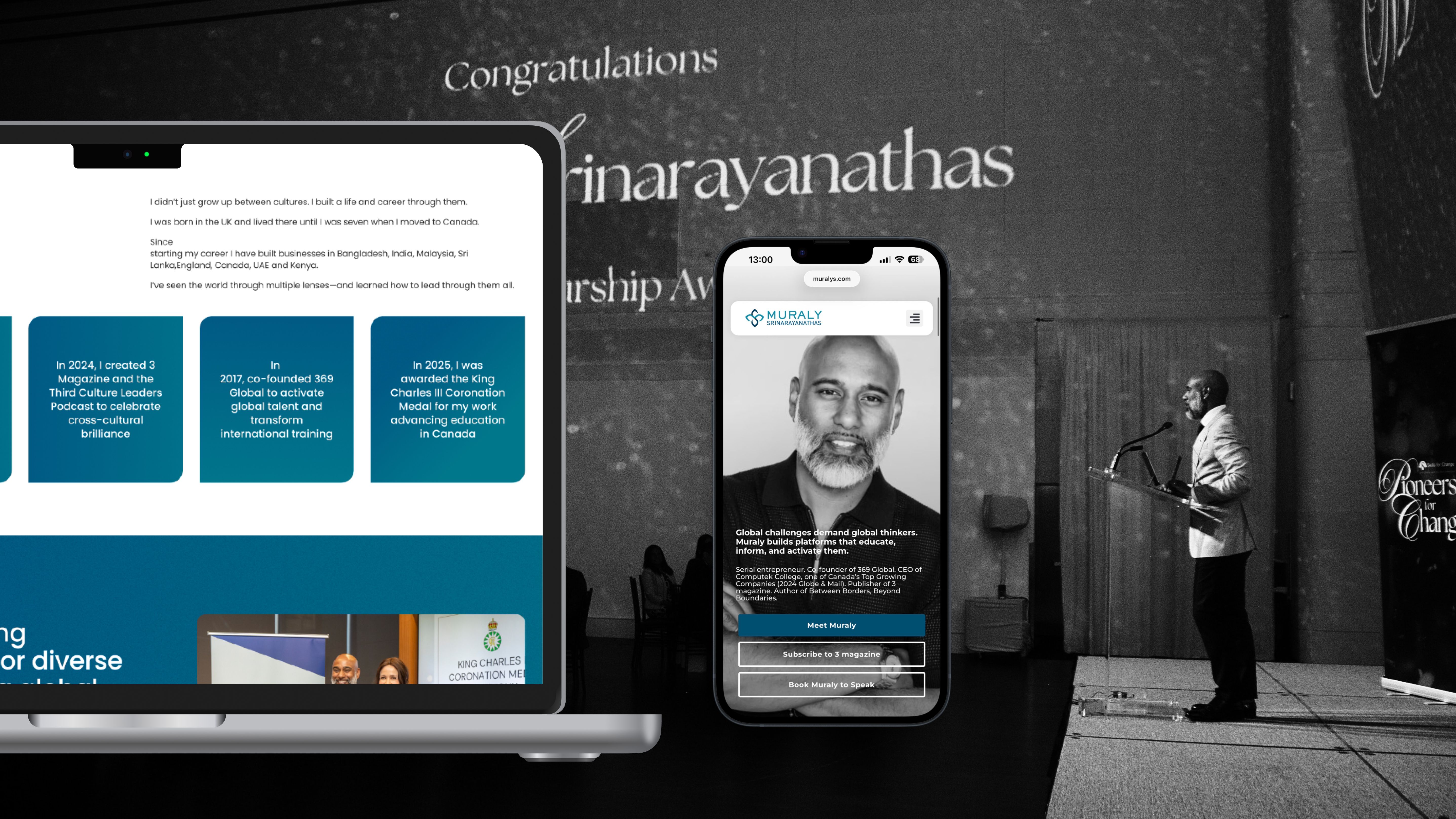
The new site keeps things minimal and refined while making sure Muraly's message reaches readers clearly and with depth.